KAZ Americana.
An identity drawn from a place.
The building, the roadside sign, the familiar rituals of a diner.
The identity begins with what is already there.
Middletown, New York
Brand identity & creative direction

01 / The architecture
The place
comes first.
I began with the diner itself. Its roofline, arched windows, stone façade, and entrance give the building a character that belongs specifically to KAZ Americana.
Translating those details into an architectural illustration gave the identity its center. The building is both the subject and the point of recognition: a place a guest can enter, remember, and carry away.


Architecture becomes illustration. Illustration becomes recognition.
02 / The roadside sign
A familiar
point of arrival.
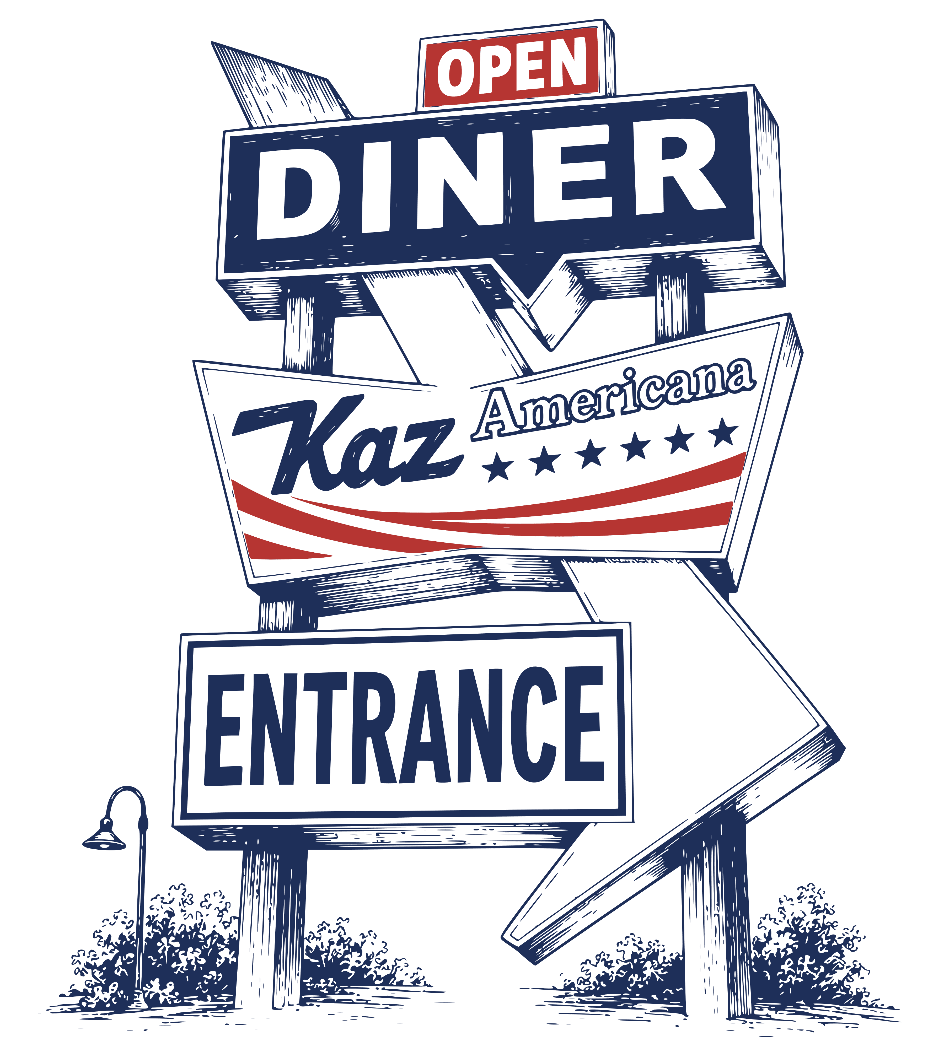
The existing roadside sign offers another expression of the same place. Its stacked panels, directional arrow, and lettering have a recognizable presence before a guest reaches the door.
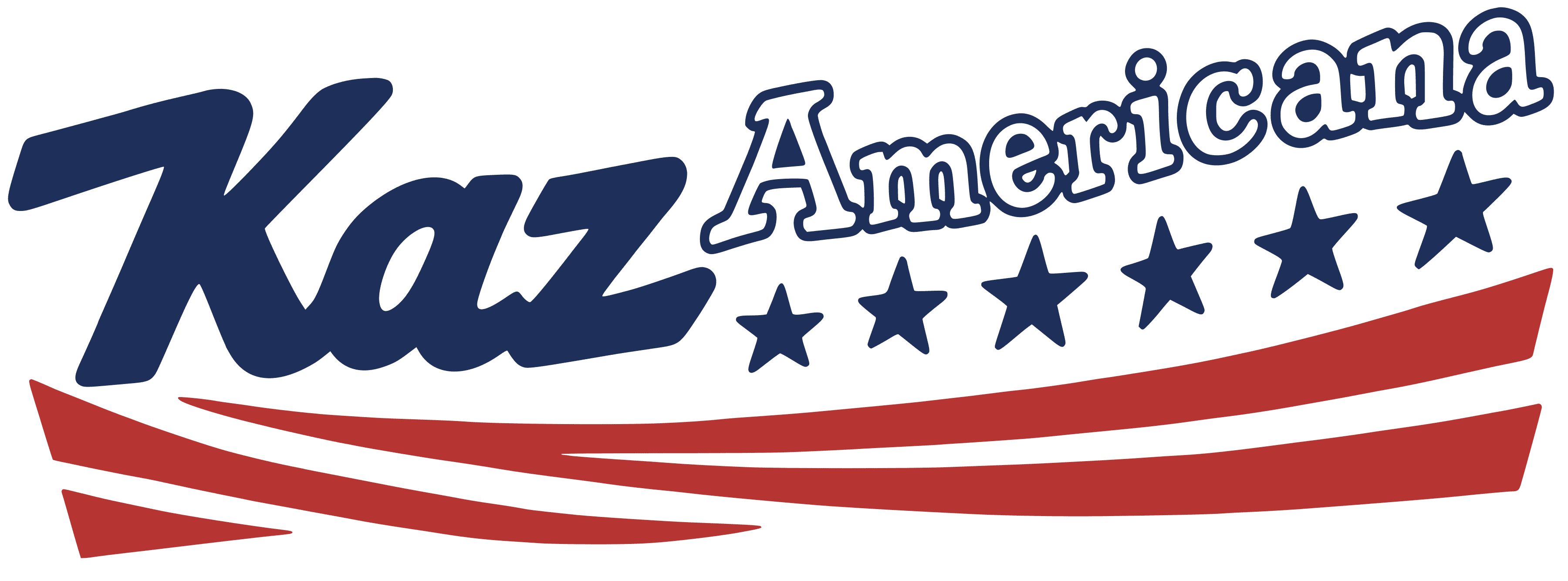
I brought that structure into the graphic language of the brand. The complete sign becomes an illustration for larger applications, while the script mark can stand on its own.
03 / The identity
One place.
Several expressions.
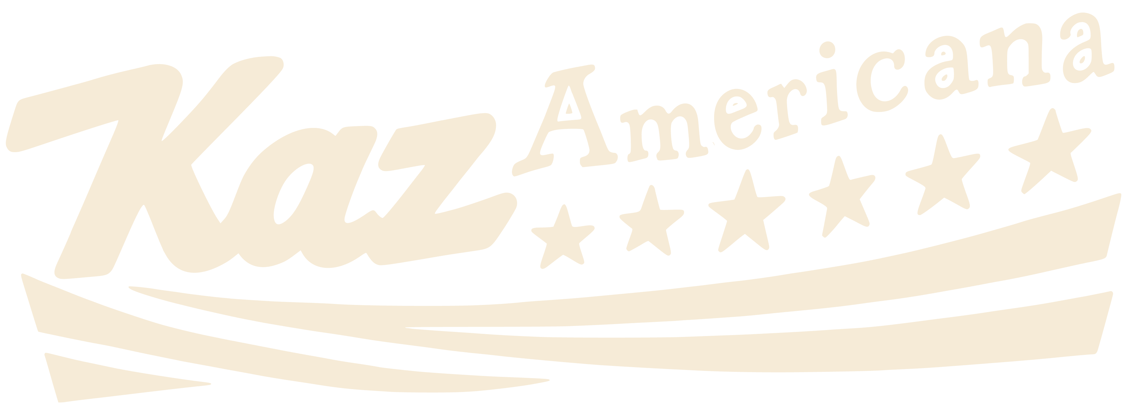
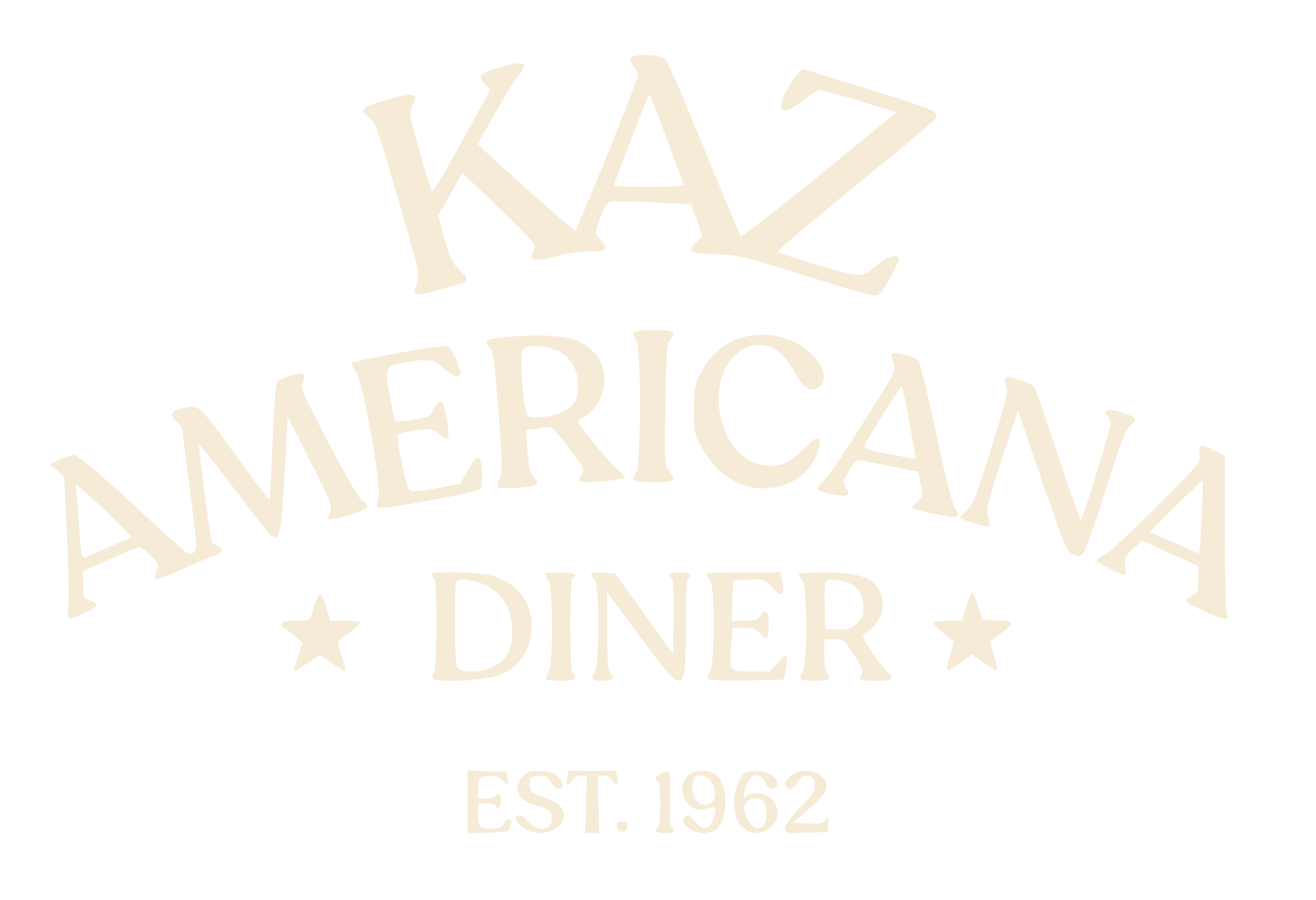
The architectural illustration, roadside sign, script logo, and stacked wordmark form a family. Each has a different role, allowing the identity to move from a detailed menu cover to a smaller garment placement without losing its character.
Navy, warm cream, and red connect the pieces. The balance shifts with the application; the sense of place remains.
04 / In application
From the table
to the everyday.
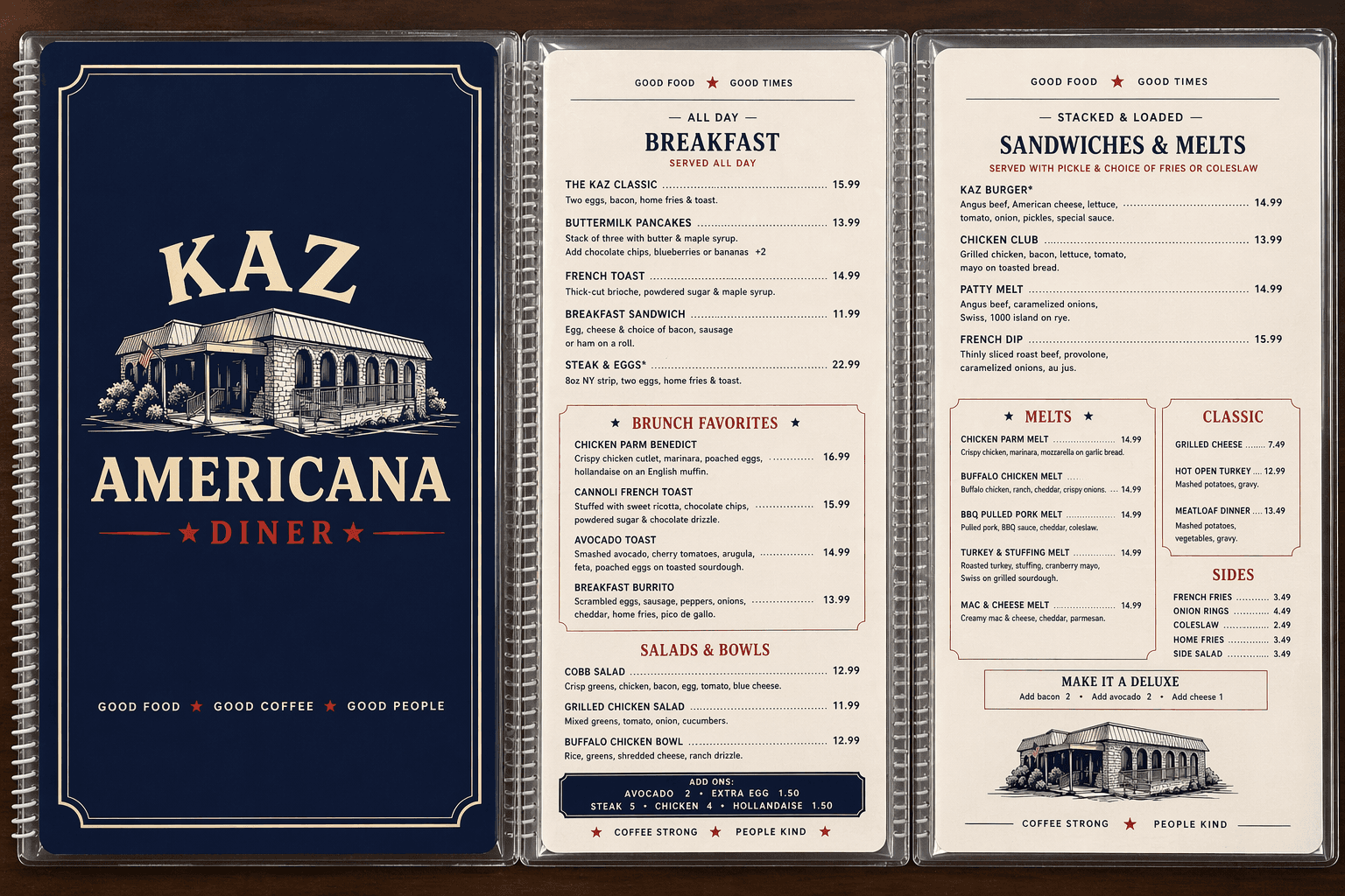
The work extends beyond the logo into the things guests see, use, and take with them. Menus bring the architectural identity to the table; merchandise concepts give the sign and script a life beyond the diner.

A consistent visual language
Good food,
good coffee,
good people.
The menu pairs a clear reading hierarchy with the warmth of the building illustration. The same details connect the restaurant’s physical character to its printed materials.
View the menu artwork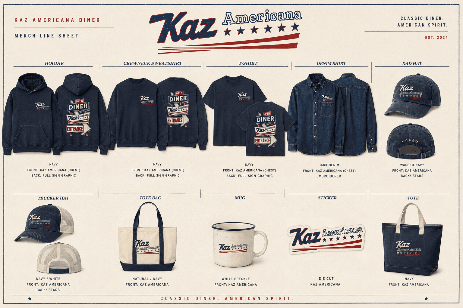
The connection between architecture and identity is the thread through this project: observing what makes a place distinctive, then giving that character a wider visual expression.
Explore more branding